When Meera first messaged me, she didn’t say “I need a new logo.” She said, “I think my business is invisible.”
She ran a small chain of home bakeries — three outlets across the city, decent foot traffic, loyal walk-in customers. But online, nothing was clicking. Her Instagram ads weren’t converting. People would visit her page, scroll for three seconds, and leave. Her website bounce rate was through the roof. She’d tried new captions, new photography, even a paid ad consultant. Nothing moved the needle.
It took me about ten minutes on a video call to spot the real problem. It wasn’t her captions, her ad budget. Her Logo was the main problem
The Logo That Was Quietly Costing Her Customers
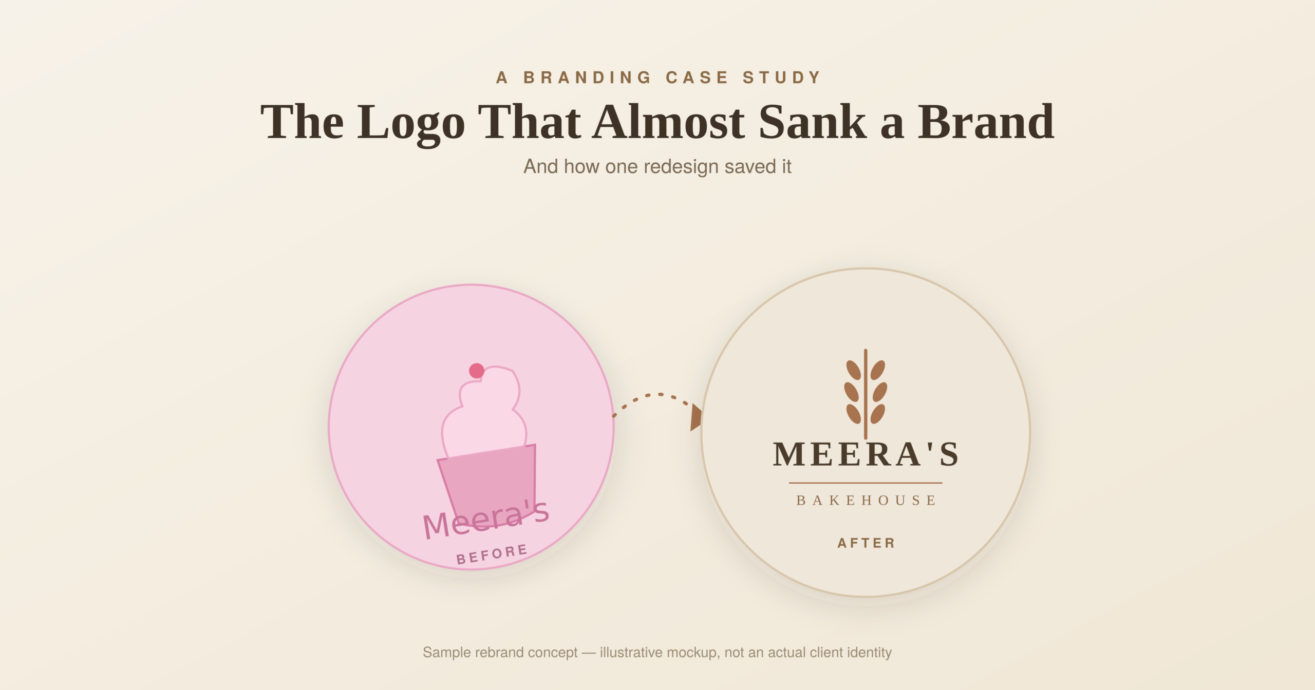
Meera’s original logo was a cursive script in a soft pastel pink, layered over a cupcake illustration that looked like it had been pulled from a free clipart pack in 2011. On its own, in isolation, it wasn’t bad. But the moment you saw it next to her actual product — rustic sourdough loaves, artisanal tarts, minimalist packaging — it made no sense. Her logo said “cute kids’ birthday cakes.” Her product said “premium, handcrafted, grown-up bakery.” The two were fighting each other, and the logo was losing her the exact customers she wanted most: people willing to pay a premium for quality.
This is the part most business owners miss. A logo isn’t decoration. It’s a promise, delivered in half a second, before a single word of copy gets read. When the promise and the product don’t match, people don’t consciously think “this logo feels off.” They just quietly lose trust and click away. That’s what was happening to Meera, ad spend after ad spend.
Starting With Questions, Not Design Software
Before I opened any design tool, I asked Meera three questions I ask every rebrand client:
- Who is your actual best customer — not who you wish was buying, but who’s already paying full price and coming back?
- If your brand walked into a room, how would you want people to describe it in one sentence?
- What’s one competitor whose vibe you admire, even if their product is different?
Her answers were revealing. Her best customers were working professionals in their 30s and 40s ordering for anniversaries, client gifts, and self-indulgence — not birthday parties for eight-year-olds. She wanted her brand described as “quietly luxurious, honest, handmade.” And the brand she admired had a stripped-back, almost editorial identity — lots of negative space, muted tones, confident typography.
None of that lived anywhere in her old cupcake-and-cursive logo.
The Redesign
[Insert before/after mockup image here — “logo-before-after-mockup.svg”]
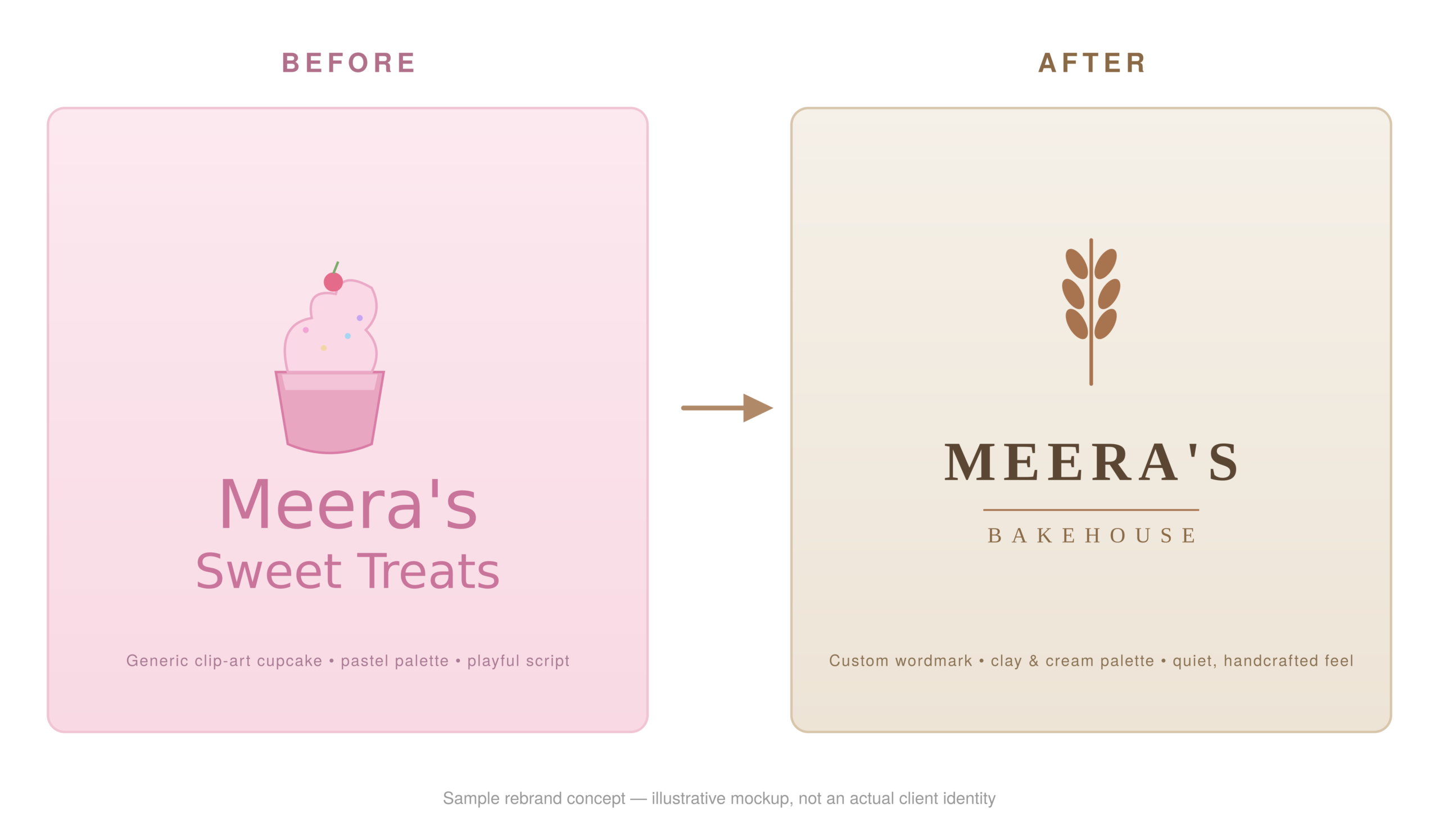
We stripped everything back. Out went the pastel pink and the illustration. In came a warm, earthy clay tone, a custom wordmark built around clean serif type (to nod to craftsmanship without tipping into “cute”), and a small hand-drawn wheat-stalk mark that could stand alone as an icon on packaging, social avatars, and delivery boxes.
Simple, but it took four rounds of revisions to get the type spacing and the icon’s weight to feel effortless rather than overworked — the kind of design that looks like it took five minutes, even though it took three weeks.
We didn’t stop at the logo. A logo redesign that isn’t rolled out consistently is almost worse than no redesign at all — it creates a jarring gap between old and new touchpoints. So we updated her Instagram grid, her packaging mockups, her website header, and even her staff aprons to match.
What Changed After Launch
Within six weeks of the new identity going live:
- Her Instagram profile visits-to-follow rate nearly doubled — people were staying long enough to actually engage.
- Her average order value increased, because the packaging now visually justified premium pricing instead of undercutting it.
- She started getting inbound corporate gifting inquiries for the first time — the exact audience the old logo had been quietly repelling.
None of her products changed. Her recipes were the same on day one and day sixty. What changed was the half-second promise her brand made before anyone tasted a single bite.
The Real Lesson
Business owners often treat branding as the last 10% — something to “get around to” after the website, the ads, and the product are sorted. But your logo and visual identity are doing silent, constant work every single time someone encounters your business. If that work contradicts what you’re actually selling, no amount of ad spend will fix it. You’ll just be paying to bring people to a door that quietly tells them to turn around.
Meera didn’t need a bigger marketing budget. She needed her brand to finally tell the truth about what she was selling.
If your online presence feels like it’s working against you rather than for you, it might not be your content or your ads — it might be worth asking whether your visual identity is still saying what your business has grown into.